How a carousel post works
Think of a carousel as a small sequence inside one post. People can stop at the opening image or swipe to see what follows. The pictures belong to the same post, so you write one caption rather than publishing a separate caption for every slide. The shared format makes it useful when several images explain something better together than they would as isolated posts.
The opening image acts as an introduction. It might establish a place, name a topic or show the finished result before a tutorial begins. Later slides should reward the decision to continue: a close detail after a landscape, another view of an outfit, or the next step in a recipe. A carousel does not need a complicated layout to have an order that makes sense.
Swipe indicators help distinguish a sequence from a single image. Presentation can vary between the feed, profile and app versions, so preview your post where you plan to share it. Avoid building your story around the assumption that everyone sees the same starting frame or that a particular algorithm will show it twice. Make the opener clear and let every later slide stand up on its own.
Carousel post vs single post vs Reel
| Format | What the viewer does | When it fits |
|---|---|---|
| Single post | Looks at one image | One strong photograph or a simple announcement |
| Carousel post | Swipes through an ordered set | Several views, a tutorial, a recap or a connected composition |
| Reel | Watches a moving sequence | Timing, movement or sound is central to the idea |
These formats are not a ranking of quality. A quiet portrait may be stronger as one image than as a sequence padded with unrelated pictures. A process that depends on motion may be clearer in video. Choose a carousel when the viewer benefits from controlling the pace, comparing two frames or reading one short thought at a time. You can also mix a collage image into a carousel without turning the whole set into one continuous strip.
Carousel post limits and sizes
| Choice | What to plan |
|---|---|
| Item count | Instagram has offered up to 20 items; confirm the limit shown by your current account before planning the full sequence |
| Media | Photos or videos; check the available combination in the posting preview |
| Seamless slides | Prepare every slide at the same dimensions and retain the exported order |
| Portrait example | 1080 × 1350 px per slide is a practical 4:5 starting point |
| Cover | Keep the key subject central and check both feed and profile previews |
A platform limit is a ceiling, not a target. Start with the number of pictures that actually belong together. A short, complete sequence is more useful than a long one that repeats itself. Instagram controls and crop options change, and account availability can differ. For connected seams, using one chosen ratio throughout is a reliable design decision even when the posting interface offers additional crop choices.
Instagram carousel size guide Work out the slide dimensions and the size of a connected panorama canvas.Types of carousel posts
A seamless panorama uses one wide scene across several slides. Each swipe reveals the next part of the photograph. A scrapbook carousel uses separate pictures, cutouts and bits of type, with only a few elements continuing over the seams. Both approaches can connect the sequence visually, but they solve different problems: revealing one scene versus bringing several memories into the same composition. See the seamless carousel workflow.
A photo dump collects moments from a period of time. It can stay informal while still alternating wide scenes, people and small details. A before-and-after post needs two clear views and enough explanation to make the change understandable. A tutorial or recipe needs a beginning, a usable sequence and a finished result. A monthly or travel recap benefits from a clear thread, such as the same place, route or recurring color. Browse photo dump ideas. Plan a travel recap.
An editorial story often relies on rhythm rather than a strict timeline. Pair a full image with a close crop, then leave a quieter slide for a line of text. A running recap might combine a scene from the route with a workout card, while a concert sequence might mix a stage picture with a visual song card. These are prompts for choosing material, not requirements to add more decoration. Explore more carousel ideas.
What makes people swipe
- Give the cover one job: introduce the moment or the question. Avoid several competing headlines.
- Give the next slide a reason to exist. It can reveal a detail, answer the question or continue a visual element.
- Keep small text away from seams. A connecting photo edge can invite a swipe without splitting an important word.
- Alternate scale and density. Follow a busy collage with a simpler image so the sequence has breathing room.
- Review the saved slides in order on your phone. Check crops, readable type and whether the ending feels complete.
In Glassy, build the composition on connected slides and move photos, text, stickers or frames across the boundaries. Begin with a template or a blank canvas at your chosen size. Export separate images in order, then select them in Instagram yourself. Glassy is an iPhone editor, not a posting or scheduling service. Video and Live Photo imports and motion exports require Plus; a still-image sequence can start with the free materials marked in the app.
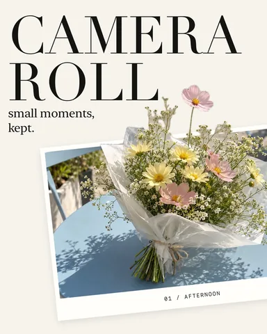 Camera Roll
 The Edit
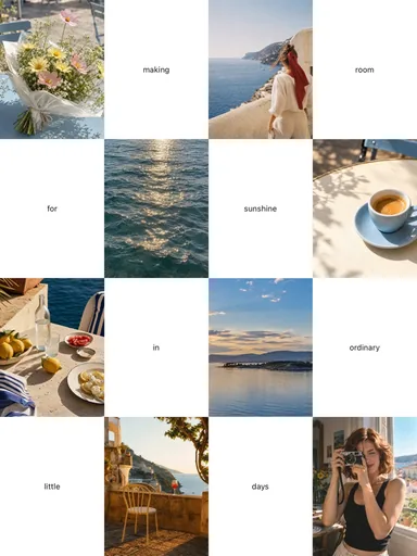 Room for Sunshine
 Glacier Journal