The cover does not need to explain every image. Its job is to establish the mood and make the next slide feel related. A month of ordinary days might need only a date and a quiet photo. A trip with many locations may benefit from a small preview grid. Start with the material you have instead of forcing the whole set into a trend that does not fit it.
10 photo dump cover ideas
- Month calendar cover: use a calendar as the organizing shape and mark the days that matter. Window Calendar or Orchard Calendar can be a starting layout; pair the month with a photo that represents its mood rather than trying to illustrate every date.
- Short title card: give the set a name such as October dump or A weekend away. Keep it to a few words with enough space around the type. October Field Notes offers a notebook-style starting point for a title-led cover.
- Mini grid preview: place four to nine pictures inside the opener so it reads like a contact sheet. Choose distinct shapes and scales rather than nearly identical portraits. The small pictures should suggest variety, not require the viewer to study details before swiping.
- Hero shot with a date: pick one photograph that works alone and add a small date or time detail. Make the picture the main event. This suits a set with a particularly strong portrait, landscape or funny opening moment.
- Weather or place card: add the small context detail that belongs to the day. Forecast Friends is a starting point for weather-led imagery. Review visible location information before sharing, especially if a map or place label identifies a private routine.
- Now-playing card: pair the cover photo with the song that reminds you of the period. Magenta Lyrics can give you a visual music starting point. A card shows the song as part of the design; it does not put its recording into the exported image.
- Palette swatch: pull the set together through a few colors from the photographs. Soft Palette Study suits this direction. Use the palette to describe what is already in the pictures rather than recoloring every memory to match an unrelated moodboard.
- Instant-print stack: make one photo feel like a print sitting over another. Leave enough of the lower frame visible to make the overlap intentional. Carry one frame edge or paper color into the next slide so the stack belongs to the rest of the story.
- Phone-interface frame: treat the set like a saved message or a little album on your phone. A familiar frame can make casual details feel collected. Keep the meaningful content larger than the decorative controls, and remove private notifications or names from any screenshots.
- A photo that continues onto slide two: place a broad scene or a paper edge across the seam. The opener should still work as a crop by itself. Camera Roll is a free two-slide place to start; preview the adjacent images to check the connection.
Free portrait cover templates
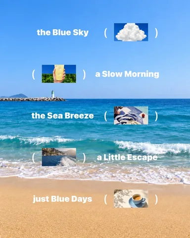 Blue Notes
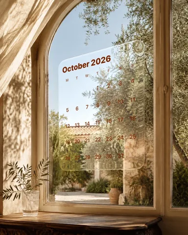 Orchard Calendar
 Off Duty
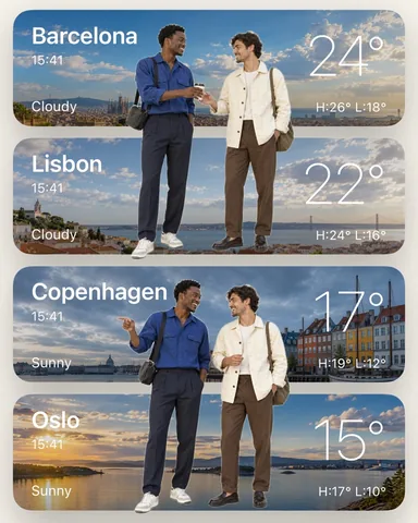 Forecast Friends
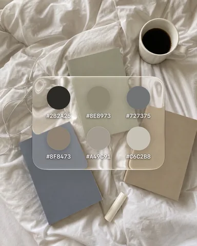 Soft Palette Study
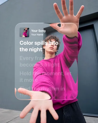 Magenta Lyrics
Make the cover work on your profile grid
A cover can be seen at several sizes and crops. Keep the person, short title or recognizable object near the center and check the current profile preview instead of assuming that it matches the full feed image. Put secondary decoration toward the edges, where a crop can remove it without changing the meaning. The same approach helps a title remain readable when the image is small.
If the cover is a tall Story-style template, check how it will crop before using it in a feed sequence. A template is an editable starting point, not a guarantee that every posting destination uses its full canvas. Review the whole set at one consistent output size when the images connect across slides. Check the carousel size guide.
Cover mistakes to avoid
- Tiny titles that only read when zoomed in. Make the essential words clear at phone size.
- Using the busiest image simply because it was taken first. A quieter cover can introduce a more detailed sequence.
- Adding a calendar, song, map and large headline to the same opener. Choose one main idea and give it room.
- Preparing the cover at a different shape from a connected carousel. A crop change can break the first seam.
- Treating the cover as a promise of better reach. A clear opener helps people understand the post; it does not guarantee engagement.
Choose one cover approach, make a quick version and view it beside slide two. If the relationship feels clear, continue building. If it feels like two unrelated posts, repeat a color, frame or small detail rather than adding another headline.